Project
Scholl Foot Expert App
Helping Scholl users to complete their treatment
Scholl Fungal Nail Treatment App
Role
UX/UI designer
Team
UX/UI designer , Project manager
About the project
The School Foot Expert App
The Scholl fungal nail app helps users to treat the infected nail and track their daily treatment. The app aims to motivate users to complete the full course of treatment and prevent reoccurrence by supporting the user through-out the 9 month treatment plan.
The Problem
Sufferers often don’t complete the course of treatment
Fungal nail can take up to a year to cure. The treatment has to be completed daily and can be confusing as the way treatment is applied changes with time. It is easy to skip days or become disheartened when results don’t happen as quickly as expected
The Challenge
Keeping users on track and motivated
Making sure sufferers complete their treatment while having realistic expectations is the biggest challenge. This is seen as an embarrassing problem which suffers don’t want to talk about and often hide
The Solution
An app that works in harmony with the Scholl Fungal Nail treatment plan
An app to track, encourage and gamify the treatment. A way to measure progress and help educate users on how to cure and prevent nail infection while at the same time staying discreet and creating realistic expectations.
Discover
Research
Comprehensive qualitative and quantitative research, including surveys, user interviews, and competitor audits, revealed that users often discontinued treatment prematurely.
Define
Problems identified


Define
User stories, flows and maps
Using the provided pain points and my hypothesis statements I came up with a range of user flows and mapped out ideas to help solve the challenges and needs of the target audience (fungal nail suffers).
After obtaining feedback from stake holders, I created a flowmap to get a high-level view and to work out the screen paths, friction points and possible “wow” moments.


Define
Competitors and ideation
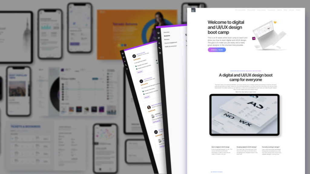
After some initial competitor research and sketchbook ideation I created low-fidelity wireframes to outline the different journeys. I then designed multiple prototypes to facilitate rapid internal and external testing.
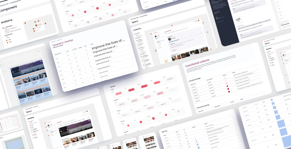
I began the design phase with hand-drawn sketches to conceptualise layouts and elements quickly. Transitioning to digital wireframes using Figma, I produced low to mid-fidelity designs. These were tested with stakeholders and project managers, leading to iterative refinements based on feedback.
Throughout the design process, I ensured adherence to iOS Human Interface Guidelines (HIG) to maintain best practices in touch points and font sizes.


Deliver
Hi fidelity designs
For th UI and visual style of this app the goal was clean and simple. This is a medical app and users felt that fungal nail is a serious condition. I wanted to strike a balance between clinical and friendly so I used elegant illustrations and rounded corners to make it approachable but serious, and a lot of white space to give a clean medical feel. Dark blue was used for the main CTA to make it feel trustworthy and reliable. Teal and bright pink accents were added to pull focus when needed.
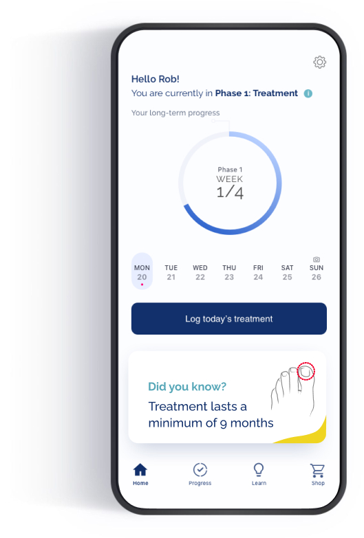
Home and tracking screens
The most important screen of the app is the home screen. Here you get an overall view of your total progress. A weekly view of days applied
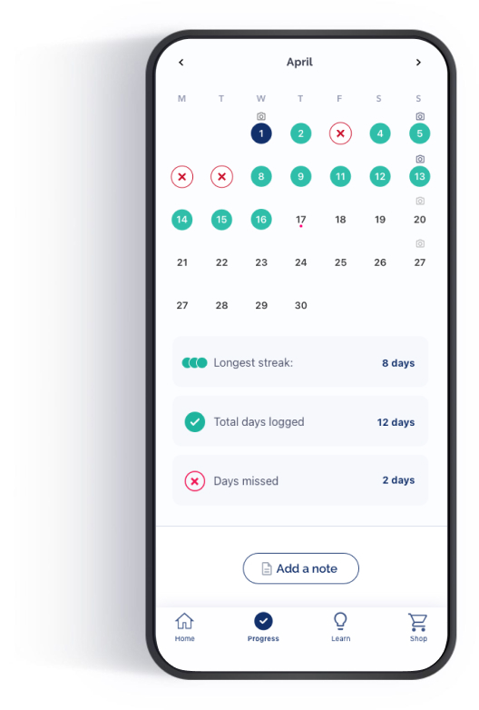
Progress
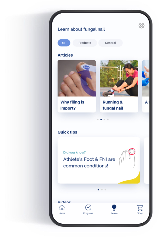
Article screens
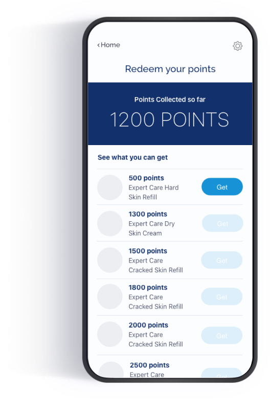
Loyalty screens
Gaining user insights
We ran 2 rounds of testing. The first round we used the mid-fi wireframes and iterated on the initial results. Once happy we tested the high fidelity designs with our panel and again iterated from there.
Over all the app was well received and we had a lot of positive feed back. The app was easy to navigate, simple to use and instructions were explained in a very digestible way. However, the game idea and time to breathe screen didn’t go down to well.
Feedback concluded that the tracking and reminder features were really useful and the comparing weekly photos was a great way to see progress and stay motivated. Armed with these insights and some post testing workshops with stake holders I had a lot to take away and re-iterate with.
Deliver
Registration
1. Straightforward
2. Reminders are useful
3. Well explained
Logging
1. Easy to understand
2. Appropriate tone
3. Possibly a bit long
Photo comparison
1. Great for seeing progress
2. Worried others may see it on my phone. Embarrassing!
Final designs
Deliver
Accessibility considerations
Imagery and Icons
Detailed imagery and icons are used to help non natives and users with sight issues identify important areas and navigate more easily.
01
Colour ratios and text size
All contrast for text and buttons were checked against WCAG accessibility standards and meet AA rating. It also has a zoom function
02
Touch points and feedback
Touch points are all set above HIGS requirements. Feed back is given for all actions to ensure the user knows whats happening at all times
03
Project takeaways
Final notes
Trust
One of the most eye opening things was just how concerned users were about privacy (fungal nail is seen as an embarrassing problem) and how thoughtful wording can make a massive impact on the users trust in the app.
Gamification
Another thing that was very interesting was about gamification. We tested
3 types of gamification:�
1. A 3 stage game that educated users on treatment as they progressed
2. A spinner that gave you a chance to win every time you applied treatment
3. Loyalty points and badges
The loyalty points came out on top (everyone loves free stuff!) but I was surprised how negative the users felt about the game and spinner. This is something I will definitely keep in mind on future projects.
Final thoughts
This project demonstrates the power of user-centered design in addressing complex challenges. Being sensitive to users emotions and motivations makes a massive difference and show that user research and testing are absolutely invaluable to the process.